The past couple of months with Nicolas and Alex we’ve been exploring “Designer Tools” startups and there’s an emerging category in that space that really caught our attention: Design Systems.
Table of content:
- Why is design handoff so painful?
- What is a Design System?
- Case Study: Shopify’s Design System
- Building a Design System
Videos
1. Why is design handoff so painful?
The past couple of years in the design and web development fields, the concept of Design system has been growing in popularity and is adopted by more and more tech teams.
The pain of design handoff
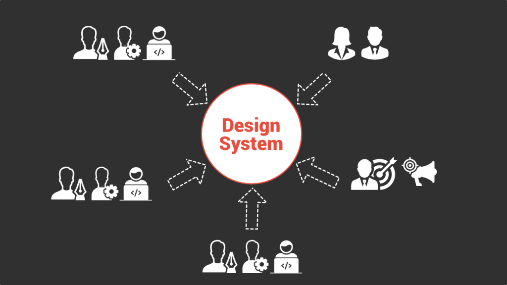
Designing and building a product for the vast majority of businesses today is a highly collaborative process and very often designer to developer handoffs generate a lot of friction.
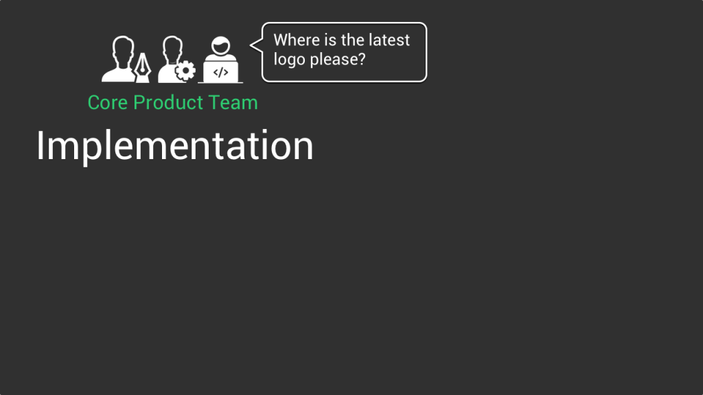
If we look at the overall process it starts with a core team consisting of a designer together with a product person working on the specifications of the product in terms of UX and UI. The tasks range from designing interfaces and user flow to creating various assets from logos, to color schemes and various UI components like buttons, navigation bar etc. etc.

In parallel you have the developers whose work is to implement these specifications and make the product come to life. In that perspective they need the assets created by the designers. Already at that stage the first friction linked to this handoff often emerges. Like “where can I find the latest logo? Where is the svg version? Do I use the right color for the submit button? Which font should I use for the main title on the homepage?” Etc. etc.
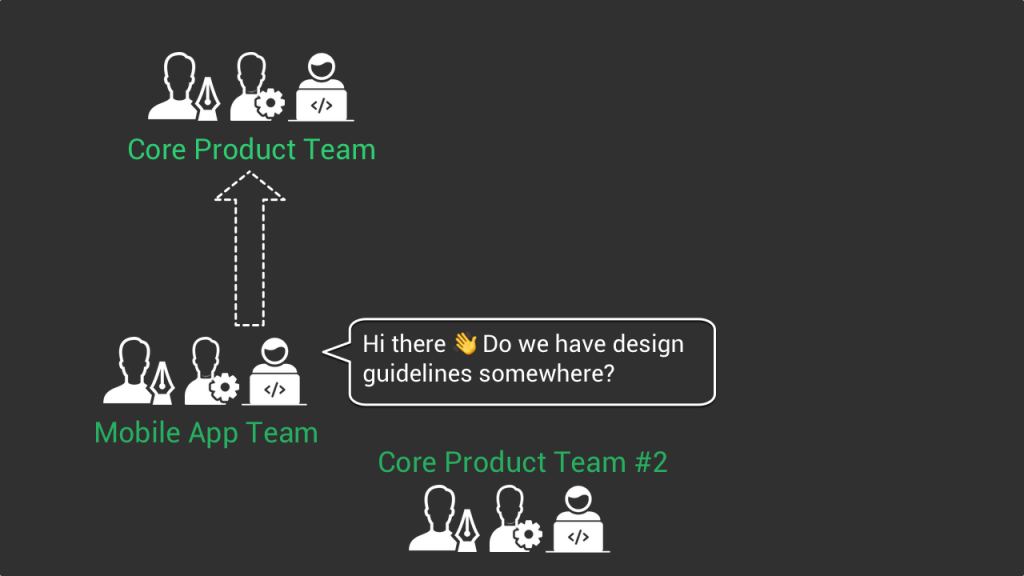
And as soon as a company grows, you add complexity to the mix, for example with the creation and maintenance of new products such as a mobile app or an additional team working on a new part of the core products. Then again, the design elements handoffs between teams can be super complex and actually slow them down.
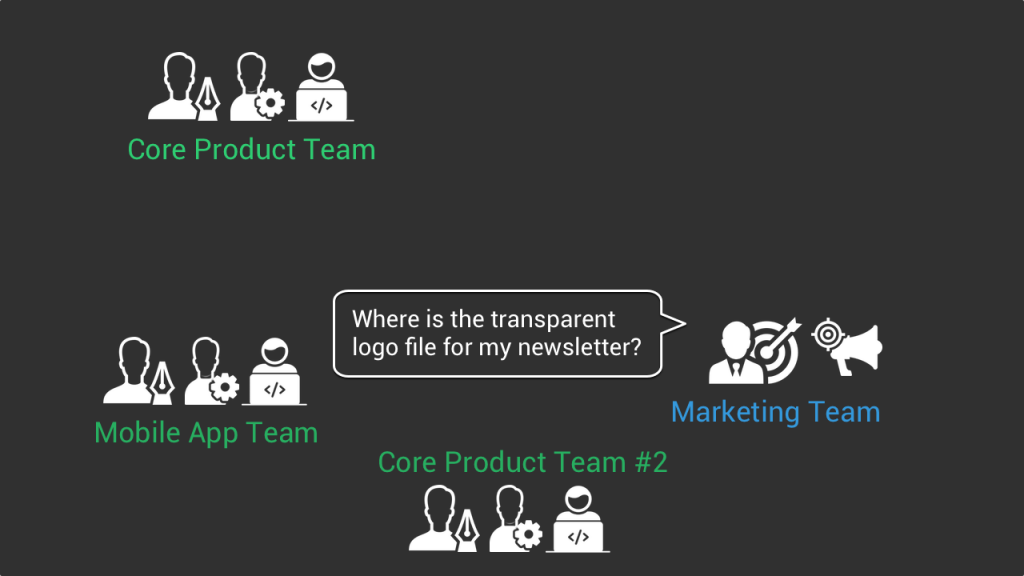
And don’t forget non-developer employees such as marketers who need access to these design assets to create their landing pages or for their newsletter.
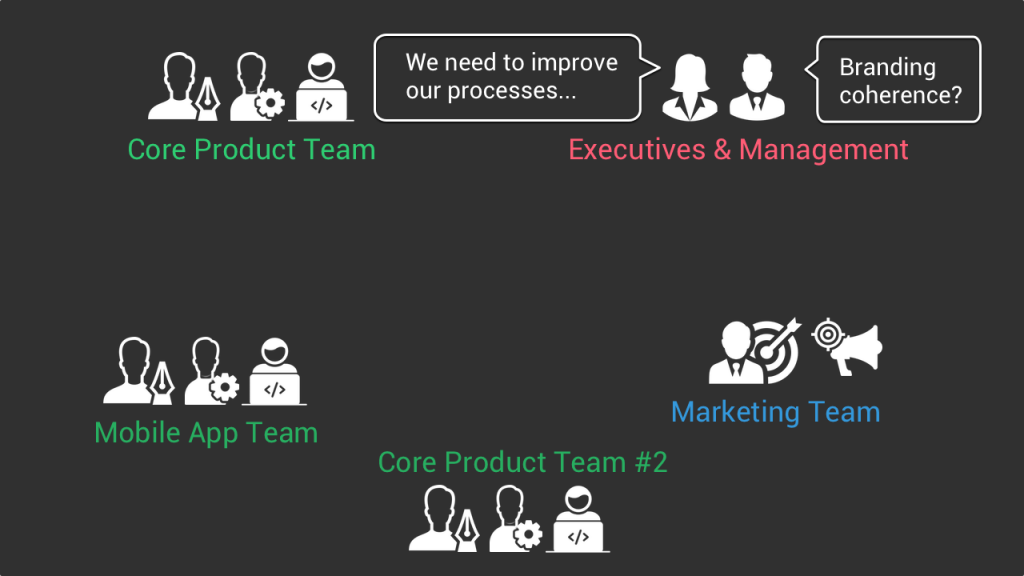
Same with the management level when the VP of engineering wants to improve internal processes to make the tech teams more efficient or when the VP of marketing wants to make sure that the branding is coherent across every product out there.
I probably don’t need to continue, as many of you already know collaboration between the design, product and developer teams is often not as smooth as we would like, and it’s precisely to solve these problems of digital asset handoffs and branding coherence that the concept of design system emerged.
2. What is a Design System?
At a high level, as Audrey Hack wrote in her article “A Design System is the single source of truth which groups all the elements that will allow the teams to design, realize and develop a product.”
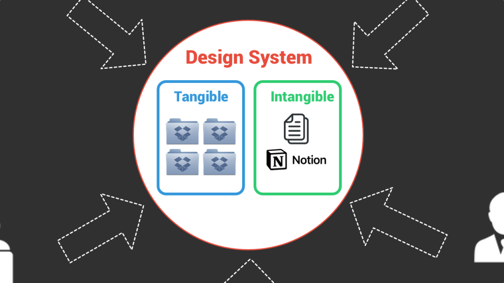
Concretely the “elements” that compose a design system are of two different types:
- The tangible elements
- The intangible elements
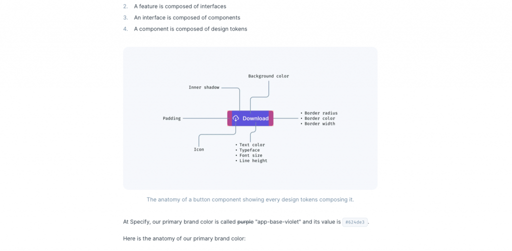
The tangible elements are the various assets such as logo files or icons that you use across your apps, but it also includes what we call design tokens and which are the values needed to construct and maintain interfaces such as spacing, color or typography values represented as data.
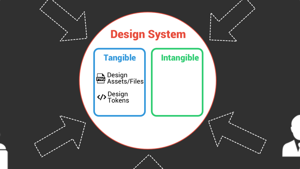
For example, if a front end developer needs to code a submit button on an interface, she’ll need to know what is the color code for the background, the size of the font or the various padding and margin values she should use.
The intangible elements are the elements that cannot necessarily be materialized through the form of data or files but are important nevertheless when you design a product, a page or even a marketing campaign.
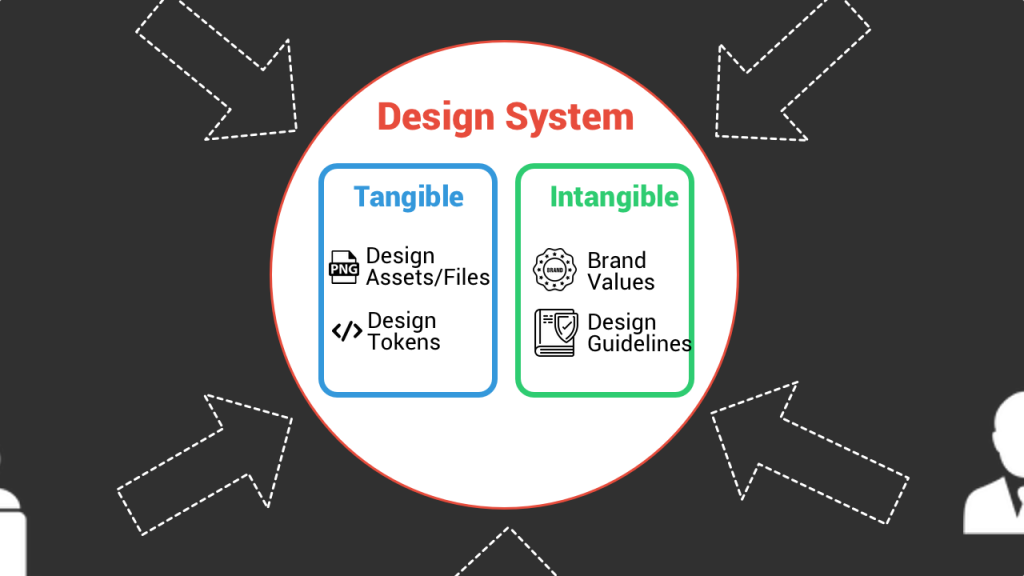
A good example of that are your brand values. For example if your brand should convey trust and seriousness you will not design interfaces the same way as if these brand values are about being fun and disruptive. It’s a super important element that a designer should know before creating design assets for example.
Now that we know what a design system is composed of, you’ll ask me how is it concretely set up. And it’s where it starts to be a bit more blurry. There is not one way to build a design system but many. Some companies have a very light design system which simply consists of shared dropbox folders to host the design files and a Notion page that lists their brand philosophy/values.
But you can also use specialized design system tools such as Specify which is kind of the Segment for design tokens and enable you to distribute your design tokens programmatically.
To sum it up, a design system is composed of both tangible and intangible elements that the designers and developers in a company need in their everyday work. Instead of running behind each of these elements all the time, a design system is a place that centralizes all these elements in one place and that developers and designers can tap into whenever they need.
3. Case Study: Shopify’s Design System
Now that we’ve covered a bit of the theory behind design systems, I want to illustrate it and show concretely what it looks like. For that purpose we’ll do a little case study by analysing a design system shared publicly by Shopify called Shopify Polaris.
What is Shopify Polaris?
When it comes to design systems, Shopify is one of the companies that has been promoting it for years. And what’s cool is that they share publicly many elements of their internal design system on a platform that any designer or developer who is building a product on top of shopify’s platform can reuse. There you’ll find many design guidelines as well as design components that are the heart of a design system.
Examples of intangible design system elements
Above I explained that in a design system we could distinguish the tangible from intangible elements, with the intangible elements being the values and philosophy behind a product.
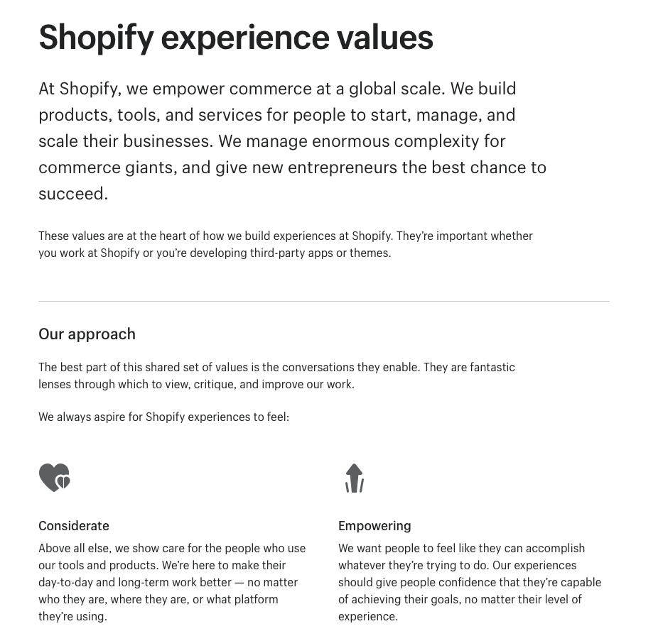
On Polaris you can find perfect examples of that. First, they sum up the core values that designers and developers should keep in mind while creating products for the shopify ecosystem on the “Shopify Experience Values” page. These six major values are considerate, empowering, crafted, efficient, trustworthy and familiar and they describe each in a couple of paragraphs.
While these values are very “general”, you also find guidelines for more specific elements, for example there’s a whole section about illustrations. On this page you can see the principles that should guide a designer when she creates an illustration for a shopify related product, like “always be useful, keep it iin the family or be considerate.
As you can see, these intangible elements are most of the time described with text, but when it comes to tangible design system elements, you’ll find more concrete formats that designers and developers can use “out of the box”.
Examples of tangible design system elements
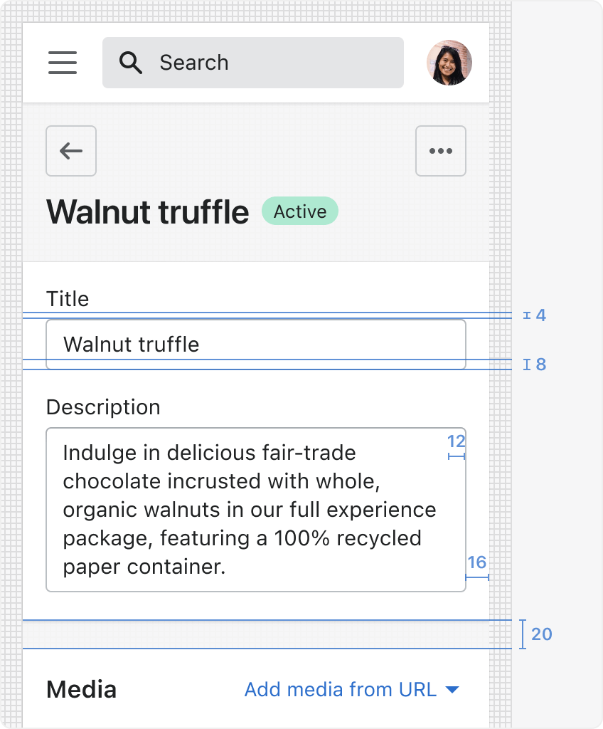
As a reminder, design tokens are the values needed to construct and maintain interfaces such as spacing, color or typography all of that represented as data. You can see a good example of that on the page dedicated to spacing. Here designers and developers can find all the spacing values they should implement in their code. Same for the typography section with all the font sizes that should be used as well as the different fonts depending on the platform where the interface lives. Shopify also shares a library of icons to be reused directly on interfaces.
These tangible elements and design tokens are concrete elements that designers and developers need to integrate in their code. This is why you very often find them in the form of code samples hosted on GitHub or of Figma files. Again Polaris provides both with a bunch of ready to use React components hosted on Github for developers and a complete FIgma UI kit for designers.
4. Building a Design System
When you look at the design system of Shopify that we’ve just covered, you might think that a design system only makes sense for big companies that have plenty of designers and developers who can afford the time and money to build such a system. The reality is that building a design system is often an iterative process.
Building a design system is a often a gradual process
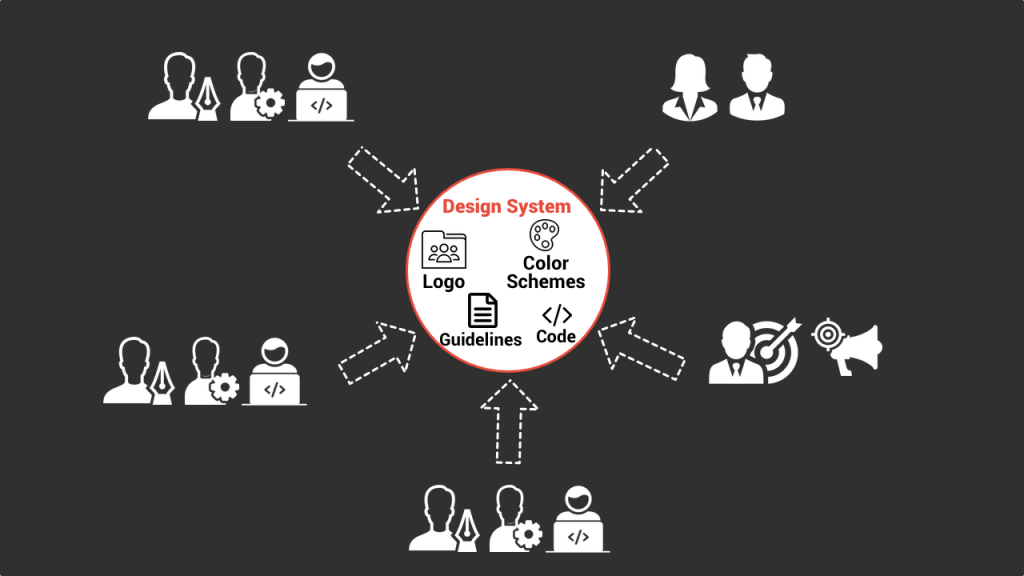
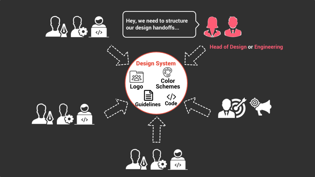
Obviously you dont put in place a design system like Shopify’s Polaris from day one. It’s generally a much more gradual process and one could argue that as soon as you share your first design assets such as your logo files in a simple shared dropbox folder, you already have the first brick of your design system.
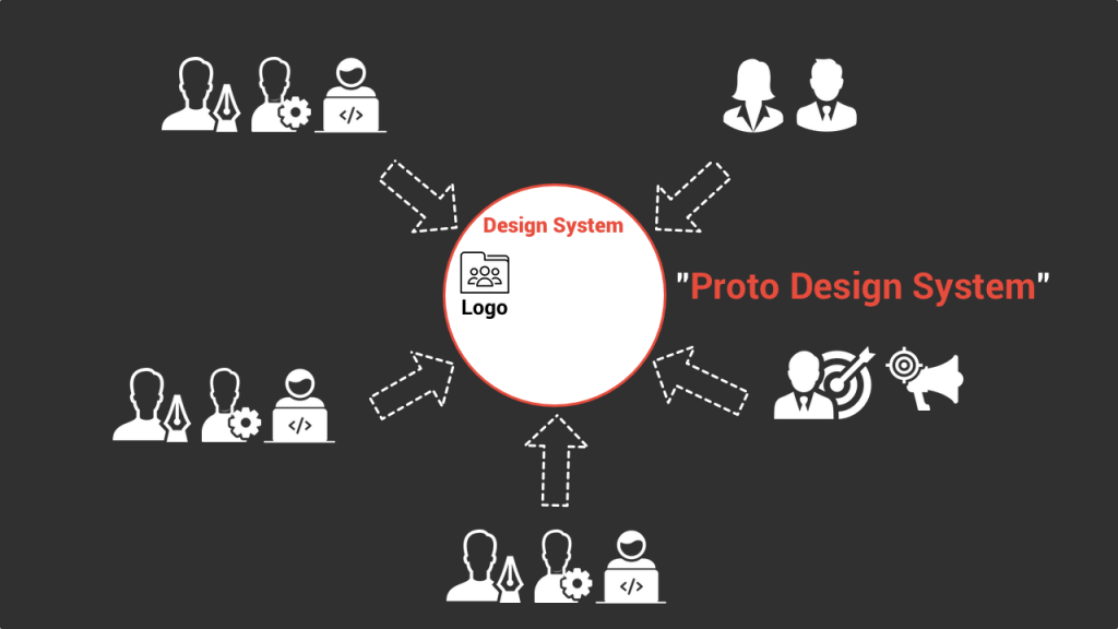
This proto Design system is super basic, but it’s a tangible design element that is shared across the teams in order to make sure that everyone uses the right logo. So in that perspective it fits our broad definition of a design system.
What generally happens after is that as a company grows, it will centralize and share an increasing number of these design elements. Following the logo you’ll have, for example, the first color schemes shared, then the first design guidelines, then the first front end design components such as a shared library of react components in your internal Github etc, etc.
And at one point it will reach a critical mass when it makes sense to have someone to properly structure this design system internally. Whether it’s the person leading the design or the engineering team, she will dedicate time and resources to put in place a more structured design system.
The bottomline is, building a design system is often an evolutive and organic process with plenty of intermediates steps before you have a really structured one internally.
And it’s the same for the design system tools that you use. Very often the first design system will live on a bunch of shared folders and a couple of Notion pages, but as the need to structure it becomes greater, it makes sense to use more powerful specialized tools.